
March 10, 2025 | Power Apps | 10 min read
Visualize the data in your view easily with Copilot (Preview)
This feature is a part of Power Platform Release Plan 2025 Wave 1, it empowers users with AI-generated visualizations to quickly uncover insights and trends from their data.
Introduction
Copilot's AI-generated visualizations help you quickly spot patterns, trends, and relationships in your data. You can easily convert tables into charts without needing any extra tools. Simply click a button to turn your data into a chart, and customize it by changing chart types or adjusting settings. You can interact with the chart and the data, and even share it with your team by copying it to the clipboard. This feature saves you time and helps you gain insights faster.
Prerequisites
- The new look must be enabled for your model-driven apps.
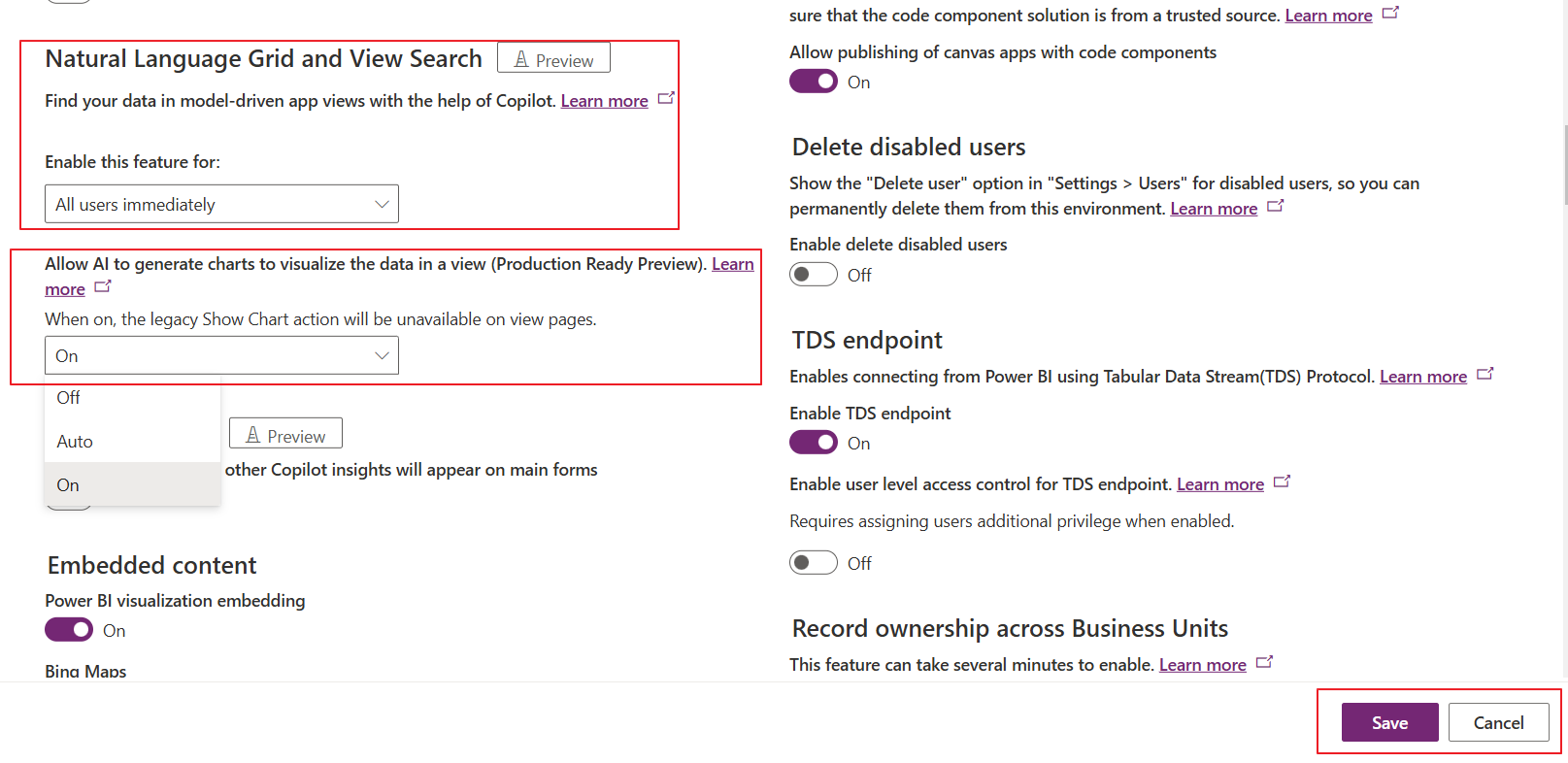
- The 'Natural Language Grid and View Search' feature should be enabled.
- The 'Allow AI to generate charts to visualize the data in a view' option must be enabled in the Power Platform admin center.
How to enable this feature?
- In Power Apps Studio, select Settings from the top-right corner.
- Under Settings, select Admin center.
- Select Environments from the left pane and then choose your environment from the options on the right.
- Click on Settings in the top ribbon.
- Under Product select Features.
- In features page, search for Allow AI to generate charts to visualize the data in a view and enable this feature.
- Click on Save to save the changes.
How it works?
After enabling this feature, when you navigate to a grid page, you'll see a Visualize button at the top. By clicking the Visualize button, Copilot will automatically generate and display a chart based on the current filters and available columns in the view.
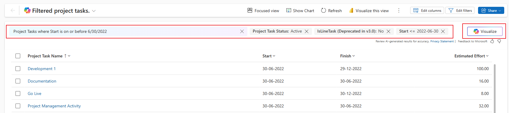
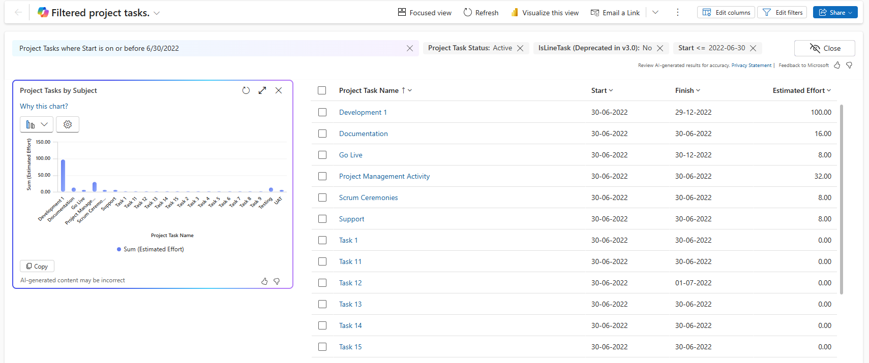
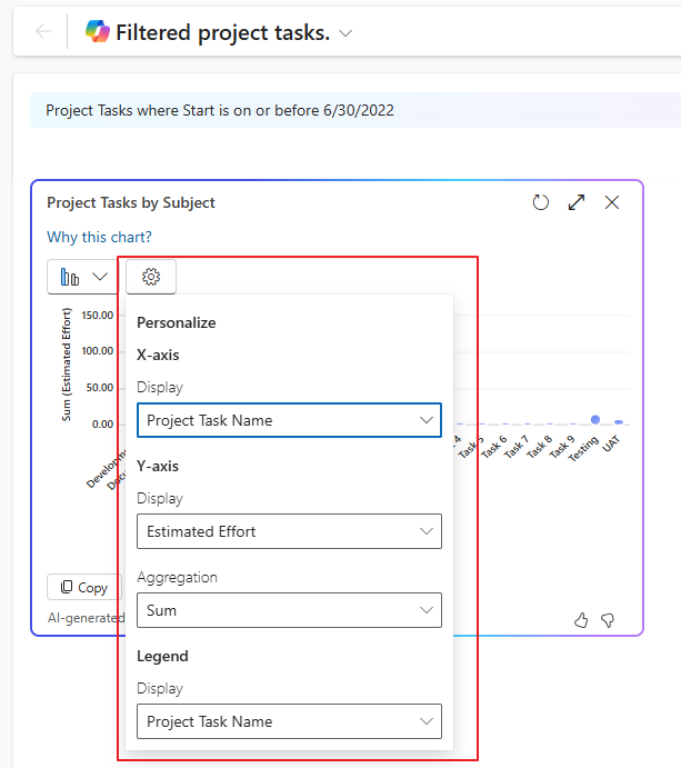
Chart Customization and Interaction
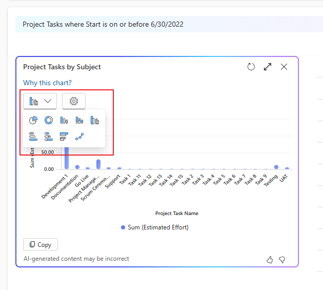
You can choose from nine predefined visualizations and reconfigure the chart as needed.
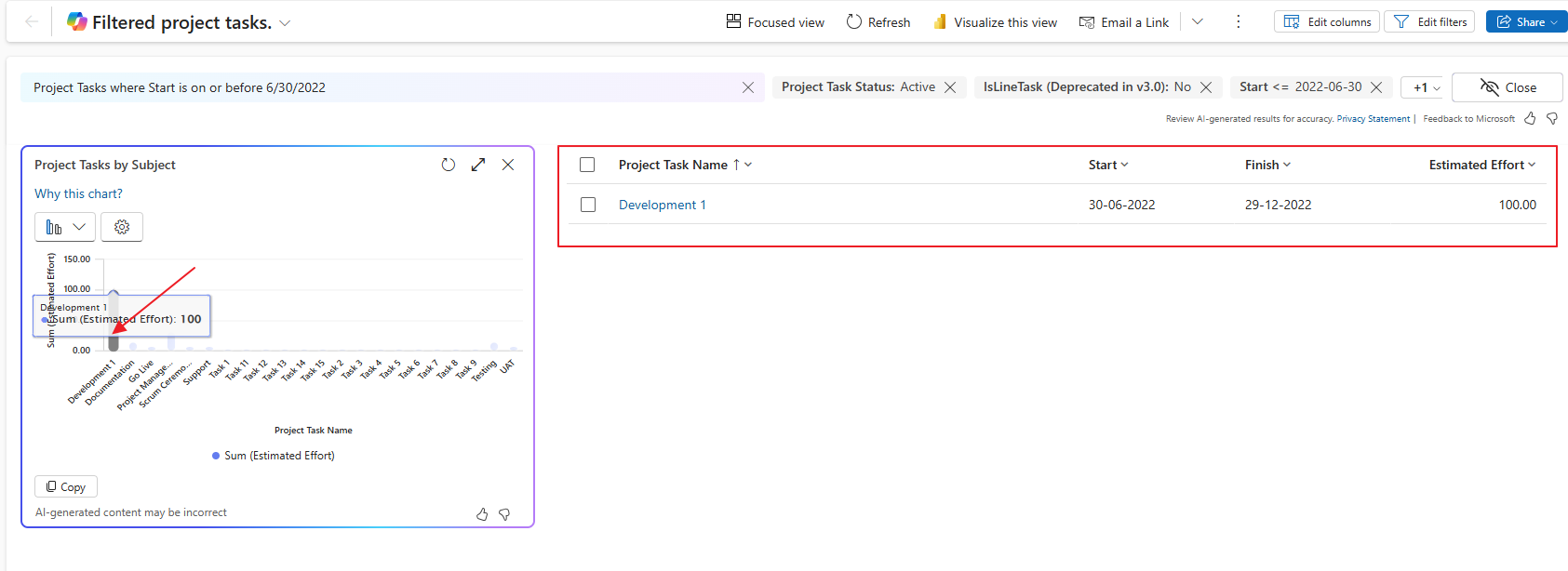
The chart is interactive, so by clicking on different parts of it, you can filter the data and view the relevant records on the right.
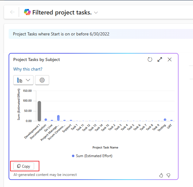
There's also an option to copy the chart and paste it as an image into another application.
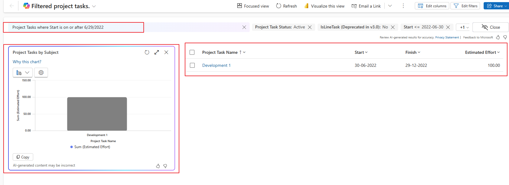
Additionally, when you filter your records, the visualization will automatically update to reflect those changes.
Conclusion
The Copilot AI-generated visualizations feature brings powerful, interactive charts to your data without the need for additional tools. By simply clicking the Visualize button, you can quickly turn your tabular data into insightful charts that are easy to understand and analyze. With the ability to customize, filter, and share visualizations, this feature helps you gain insights faster, enhancing your data-driven decision-making process. Using natural language, you can add extra conditions to your current view. Besides filtering records, you can also define how the data should be sorted.
Note: This feature is currently in preview and will be improved with each weekly release.
- Enabled for : Users by admins, makers, or analysts
- Public Preview : Mar, 2025
- General Availability: Apr 2025